
Decoding Your First Chart Without the Confusion

That first look at a stock chart can be daunting. But understanding these charts is a fundamental skill for any new investor. This section will simplify the key parts of a stock chart, empowering you to interpret market data with assurance.
Understanding the Axes and Basic Price Information
Every stock chart is built upon its axes. The x-axis (horizontal) shows time, while the y-axis (vertical) displays the stock’s price. This simple framework allows you to see how a stock’s price has fluctuated over a chosen period.
You might view a stock’s activity over a day, a week, a month, or even years. The period you select determines the level of detail.
The most common chart type for beginners is the line chart. This chart connects the closing prices of the stock over your chosen timeframe. Closing price is the last price a stock traded at during regular market hours.
You will also frequently see the opening price (the first price of the trading day), along with the high and low prices for the day. These values provide a quick overview of the stock’s daily price action.
The Story Behind Volume Bars
Beyond price, volume is another critical factor, shown as bars at the bottom of the chart. Volume represents the number of shares traded during a given period.
Volume is a powerful indicator of market activity and interest in a stock. High volume often occurs with big price swings, validating the strength of a trend.
For example, a significant price jump with high volume suggests strong buying pressure and potential for further gains. Conversely, low volume during a price drop could signal a weaker trend.
Navigating Charting Platforms
Many charting platforms are available, but for beginners, simplicity is best. Yahoo Finance or Google Finance offer free, easy-to-use charts with essential information.
As your skills grow, you can explore advanced features on platforms like TradingView. These platforms offer more tools, but initially, focusing on the basics will help you avoid feeling overwhelmed.
Mastering these fundamentals first is key. You can then gradually increase the complexity of your analysis. By understanding these basic elements, you’ll be well on your way to confidently interpreting stock charts and making smarter investment choices.
Reading the Market’s Psychology Through Trends and Levels

Stock charts are more than just lines on a graph. They’re a visual story of investor sentiment, a window into the collective mind of the market. For those beginning their journey in stock analysis, learning to interpret this “market psychology” is the key to unlocking the chart’s secrets. This section will explore how trends and key price levels can illuminate the emotional currents driving market movements.
Identifying Trends: The Foundation of Chart Analysis
Trends represent the direction of a stock’s price over a period of time. An uptrend signifies a rising price, marked by progressively higher highs and higher lows. Picture a staircase climbing upwards – each step represents a new peak in price, followed by a higher trough before the next ascent.
On the other hand, a downtrend illustrates falling prices, characterized by lower highs and lower lows. Like a descending staircase, each step marks a new low, briefly interrupted by a shallower rebound before the next decline. Recognizing these trends allows you to anticipate the general direction of the stock’s price movement.
Understanding these trends is essential for beginners learning to navigate the world of stock charts. Equally important is grasping the concepts of support and resistance levels, crucial tools for making sense of price fluctuations. Stocks in an uptrend consistently push higher, setting new highs and lows. Downtrends, conversely, show a pattern of declining highs and lows. Support is the price level where a falling stock tends to attract buyers, potentially triggering a rebound. Resistance, on the other hand, acts as a ceiling, a price point where rising stocks often encounter sellers, potentially causing a pullback. You can delve deeper into these concepts on Schwab.
Understanding Support and Resistance: Psychological Barriers
Support levels function like a safety net for falling prices, a point where buying pressure typically overwhelms selling pressure, preventing further declines. Resistance levels, conversely, act as a barrier to rising prices, a point where selling pressure overpowers buying pressure, halting upward momentum.
Visualize these levels as psychological boundaries. Traders often gravitate towards support levels, anticipating a price bounce, and tend to sell near resistance levels, expecting a price pullback. This predictable behavior can be a valuable asset for informed investors.
Drawing Trend Lines: Connecting the Dots
Trend lines are drawn by connecting the highs in a downtrend (forming resistance) or the lows in an uptrend (forming support). These lines help visualize the trend’s direction and strength. A steeper trend line suggests a robust and decisive trend, while a flatter line indicates a weaker, more hesitant trend. The angle of the line itself reflects the pace of price change. Breaching these trend lines can herald a potential shift in direction, a possible trend reversal.
Recognizing Reversals: Spotting the Shift in Momentum
No trend endures indefinitely. Market sentiment inevitably shifts, leading to reversals. Recognizing the early signs of a potential reversal is crucial for protecting your investments and minimizing losses. Decreasing trading volume during an uptrend, or increasing volume during a downtrend, can signal weakening momentum. A decisive break through key support or resistance levels can further confirm a trend reversal, indicating a fundamental shift in market psychology. By understanding these dynamics, even beginners can begin interpreting stock charts with growing confidence and insight.
Mastering Multiple Timeframes Like a Pro
One of the biggest mistakes new traders make is focusing on only one timeframe when analyzing stock charts. It’s like trying to grasp a novel’s plot by reading just one sentence – you miss the full story. Looking only at a daily chart, for example, shows short-term price changes but might not reveal the larger, long-term trend. Savvy traders know that using multiple timeframes together offers a much richer understanding.
Why Multiple Time Frames Matter
Different timeframes tell different parts of the story. A daily chart provides a close-up view of price movements, revealing daily volatility. But this short-term focus can be distracting, making it hard to separate real trends from random price swings. That’s where longer timeframes help.
A weekly chart smooths out the daily ups and downs, highlighting the medium-term trend. It helps filter the short-term noise, giving a clearer sense of where the stock might be heading over weeks or months. For investors with a longer horizon, monthly or even yearly charts are vital for understanding the stock’s overall, long-term trajectory.
The infographic below illustrates how moving averages appear drastically different depending on the chosen timeframe. The chart shows the interplay of price action with the 20-day, 50-day, and 200-day Simple Moving Averages (SMAs).
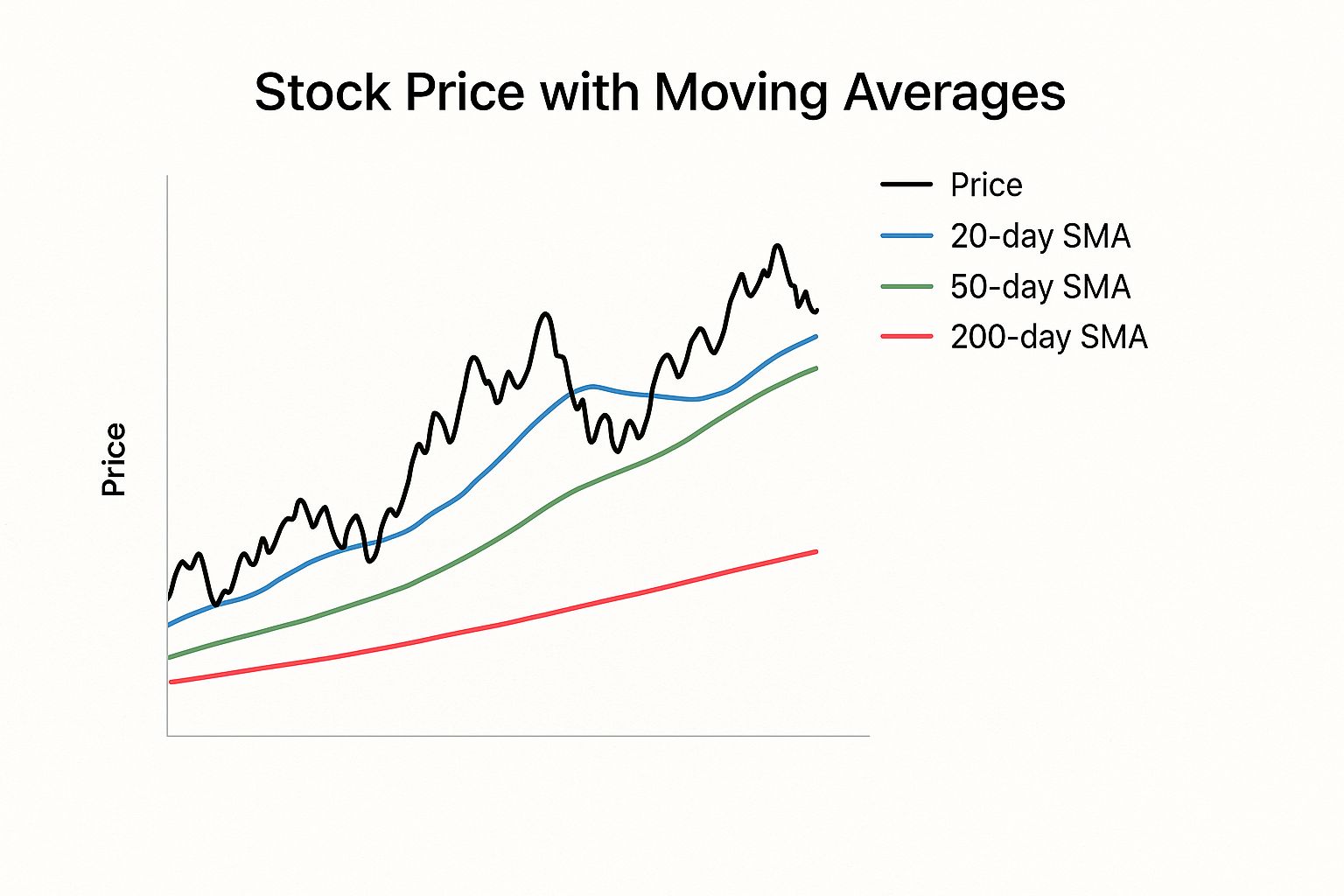
As you can see, shorter-term moving averages, like the 20-day SMA, react quickly to price changes, while longer-term averages, such as the 200-day SMA, offer a smoother, more stable perspective on the trend. Analyzing stock charts using different timeframes provides valuable insights into a stock’s performance and helps you make smart investment choices. A one-year chart reveals the stock’s movements over the past 12 months, including short-term trends and volatility. Ask yourself: is the price generally trending up, down, or sideways? These patterns can indicate growth, decline, or stagnation. Delve deeper into this concept with this insightful YouTube video.
Combining Timeframes for Better Decisions
Experienced traders often employ a top-down approach, starting with the longest timeframe (like monthly or yearly) to identify the overall trend. Then, they step down to shorter timeframes (weekly, daily) to pinpoint precise entry and exit points.
For example, if a monthly chart shows an uptrend, a trader might examine the weekly chart for potential dips or periods of consolidation – ideal buying opportunities. They might then use the daily chart to time their entry even more precisely based on specific patterns or indicators.
Choosing the Right Timeframes for Your Style
The best timeframes for you depend on your trading style. Long-term investors focus on the bigger picture and use monthly and yearly charts. Swing traders, holding positions for days or weeks, typically use weekly and daily charts. Day traders, who open and close positions within a single day, rely heavily on intraday charts like 5-minute, 15-minute, or hourly charts.
Let’s explore different timeframes with a detailed comparison. The following table offers a clear overview of how each timeframe can be used.
Time Frame Analysis Comparison: A comparison of different chart timeframes and what insights each provides for stock analysis
| Time Frame | Best Used For | Key Insights | Ideal For Beginners |
|---|---|---|---|
| Monthly/Yearly | Long-Term Trend Analysis | Overall direction of stock price over extended periods | Yes, for understanding broad trends |
| Weekly | Intermediate-Term Trend Analysis | Smoothing out daily noise, identifying potential swing trading opportunities | Yes, for a balanced perspective |
| Daily | Short-Term Trend Analysis & Volatility | Detailed view of price action and daily fluctuations | Yes, but can be overwhelming without context from longer timeframes |
| Intraday (e.g., 5-min, 15-min, Hourly) | Day Trading | Very short-term price changes for quick trades | No, best suited for experienced day traders |
The table summarizes the key takeaways for each timeframe, helping you choose the right ones for your analysis.
By mastering multiple timeframes, you’ll understand market dynamics better, validate trading ideas with more confidence, and avoid costly mistakes based on short-term fluctuations. You’ll see the forest and the trees, making smarter decisions with a complete view of the market.
Spotting Patterns That Actually Predict Price Moves

Forget overly complicated chart patterns. This section focuses on reliable, beginner-friendly formations that consistently appear and actually deliver results. These formations reflect the dynamic interplay between buyers and sellers, creating predictable trading opportunities. By understanding these dynamics, you’ll gain a valuable edge in reading stock charts, especially as a beginner.
Continuation Patterns: Riding the Trend
Continuation patterns signal a temporary pause in a prevailing trend, not a complete reversal. They offer a chance to join an established, upward-moving trend or add to your current position.
One common example is the flag pattern. This pattern visually resembles a flag on a pole, marked by a brief period of consolidation (the flag) followed by a price breakout in the direction of the original trend (the pole).
Another reliable pattern is the pennant, similar to a flag but with converging trendlines forming a triangular shape. Both the flag and pennant formations suggest the existing trend will likely resume after a short pause.
Reversal Patterns: Spotting the Change
Reversal patterns, on the other hand, suggest a potential shift in the trend’s direction. The head and shoulders pattern is a classic reversal signal. This pattern features three peaks: the middle peak (the head) is the highest, flanked by two lower peaks (the shoulders).
A break below the “neckline” (the support line connecting the lows between the head and shoulders) often signals a downtrend. Conversely, an inverse head and shoulders pattern (featuring three troughs instead of peaks) can signal an impending uptrend. Recognizing these reversal patterns is crucial for adapting to changing market conditions.
Technical analysis, which uses stock charts to forecast price movements, is a recognized method that complements fundamental analysis. While fundamental analysis evaluates a company’s financial health, technical analysis focuses on historical price and volume data to identify trends and potential turning points. This approach is rooted in market psychology, reflecting collective investor sentiment and behavior. Learn more about technical analysis here.
Consolidation Patterns: Preparing for the Breakout
Consolidation patterns represent periods of market indecision, where the price trades within a defined, narrow range. This sideways movement often precedes a significant breakout.
The symmetrical triangle, formed by converging trend lines, is a common consolidation pattern. A breakout above the upper trend line often signals an uptrend, while a break below the lower trendline suggests a downtrend.
Another common pattern is the rectangle, where the price oscillates between two parallel support and resistance levels. These patterns highlight periods of accumulating energy, which can eventually be released in powerful price movements.
Recognizing Patterns in Real Time
Spotting chart patterns as they develop, not after the fact, is the key to successful trading. Focus on price action within the context of prevailing trends and established support/resistance levels. Look for volume confirmations: increasing volume during breakouts adds strength and validity to the pattern.
Finally, remember that no pattern guarantees a specific outcome. Combining pattern recognition with other technical indicators and a thorough understanding of current market conditions will significantly improve your prediction accuracy. Learning and recognizing these chart patterns provides beginners with invaluable tools for more informed trading decisions.
Understanding What Volume Really Tells You
Volume is the unsung hero of stock analysis. While many beginners fixate on price, understanding volume provides valuable context, like a fuel gauge for stock movements. Learning to interpret volume patterns can confirm trends, highlight institutional activity, and even reveal early warning signs.
Volume and Price: A Dynamic Duo
Think of price and volume as two sides of the same coin. Price is the altitude a stock reaches, while volume is the thrust propelling it. A strong price increase accompanied by high volume suggests robust buying pressure, like a rocket with a powerful engine – poised for further ascent. This scenario often occurs when a stock breaks through a resistance level with conviction, hinting at continued gains.
Conversely, a price increase with low volume can signal a weak trend, like a rocket sputtering on low fuel. It may stall or even reverse course. Similarly, low volume during a price drop may indicate a lack of selling conviction, potentially foreshadowing a reversal.
Volume Spikes: Anticipating Big Moves
Volume spikes are like a sudden surge of energy in the market, often preceding significant price swings, particularly breakouts. Imagine a crowd gathering before a major announcement. The growing crowd (increasing volume) generates anticipation for the news (the breakout). This is often indicative of large investors accumulating positions before the stock garners wider attention.
On the flip side, a high-volume decline could signal a rush to the exits. Recognizing this pattern can help you avoid being trapped in a falling stock.
Volume Indicators: Tools for Deeper Insights
Several indicators can enhance your volume analysis. The On-Balance Volume (OBV) indicator, for instance, measures cumulative buying and selling pressure. A rising OBV confirms a healthy uptrend, while a falling OBV may warn of a potential decline, even if the price is still rising. This divergence can be a valuable early warning sign.
The Money Flow Index (MFI) is another helpful tool. By considering both price and volume, the MFI identifies overbought and oversold conditions, assisting in pinpointing potential turning points in the market.
Sidestepping False Breakouts with Volume
False breakouts, where a stock briefly pierces a support or resistance level only to quickly reverse, can be costly. Volume analysis helps you avoid these traps. A breakout on low volume often signals a false breakout, like a weak attempt to breach a barrier. The lack of conviction suggests the price move is unsustainable. Waiting for confirmation from higher volume can save you from premature entries or exits.
By grasping the interplay between volume and price, you can uncover stronger trading opportunities, validate breakouts, and potentially sidestep losses. Mastering volume analysis adds a powerful dimension to your chart reading and trading decisions.
Choosing Tools That Actually Help You Succeed
Embarking on your stock market journey? One of the most crucial steps is selecting the right charting tools. These tools are your window into the market, transforming raw data into understandable insights. With the right platform, you’ll gain the confidence to navigate the complexities of the stock market and make informed decisions.
Essential Features for Beginners
Starting out, it’s easy to get overwhelmed by complex features. Focus on these essentials to build a solid foundation:
Clean and Customizable Charts: A clear chart is a powerful chart. Look for platforms like TradingView that let you adjust chart types (line, candlestick), timeframes (daily, weekly), and indicators, creating a personalized view of the market.
Real-Time Data: In the fast-paced world of trading, real-time data is essential. Delayed data can lead to missed opportunities. Prioritize platforms with live, streaming quotes.
Drawing Tools: Analyzing price action requires more than just looking at charts. Drawing tools allow you to identify trends, support, and resistance levels, giving you a deeper understanding of market movements.
Watchlists and Alerts: Stay organized and focused with customizable watchlists. Set real-time alerts to be notified of key price changes, ensuring you never miss a critical moment.
Mobile Accessibility: The market moves fast. Mobile access lets you stay informed and react to changes even when you’re away from your computer.
Comparing Popular Charting Platforms
Choosing the right platform can feel overwhelming. To help you navigate the choices, we’ve compiled a comparison of some popular options. The table below highlights the key features, pricing, and suitability for beginners.
Popular Charting Platforms Comparison: A detailed comparison of top charting platforms for beginners, including features, pricing, and ease of use
| Platform | Free Features | Premium Cost | Best For | Beginner Rating |
|---|---|---|---|---|
| TradingView | Basic charting, some indicators, community features | Varies depending on plan | Active traders, technical analysis enthusiasts | 4/5 |
| Yahoo Finance | Basic charting, limited indicators, news and research | Free | Casual investors, fundamental analysis | 3/5 |
| Broker-Provided Tools | Often basic charting, integration with trading account | Usually included with brokerage account | Convenient for executing trades directly | 2/5 (varies greatly between brokers) |
TradingView offers a comprehensive suite of tools and a vibrant community, but it can be a bit complex for absolute beginners. Yahoo Finance is a great starting point with free access to basic charting and research, ideal for casual investors. Broker-provided tools offer convenience but often lack the depth of dedicated charting platforms. Consider your needs and experience when making your decision.
Setting Up Your Charting Workspace
Once you’ve selected your platform, create a personalized workspace that empowers your analysis. Organize your watchlists, choose your preferred indicators, and experiment with chart styles. A well-organized workspace will improve your efficiency and help you focus on the market.
Mobile Apps: Staying Informed On-The-Go
Mobile apps offer incredible convenience, enabling you to stay connected to the market wherever you are. Use them for quick price checks, monitoring alerts, and staying updated on market news. However, for in-depth analysis, stick to your desktop workspace for a more comprehensive view.
By selecting the right tools, organizing your workspace, and using mobile strategically, you’ll be well-equipped to analyze stocks with confidence. Remember, the best charting tools are the ones you use consistently and understand thoroughly. Your journey to mastering stock charts begins with choosing the right tools and building a strong foundation.
Your Roadmap From Charts to Confident Trading
You’ve learned the basics of stock charts. Now, let’s create a plan to turn that knowledge into consistent trading success. This section provides a practical, actionable strategy—complete with timelines and achievable milestones—to guide your development from beginner to confident trader.
Building a Consistent Analysis Routine
Random guessing won’t get you far in the stock market. A systematic approach to chart analysis is essential. Begin by cultivating a daily routine. Set aside 15-30 minutes each day to review the charts of stocks you’re watching. Concentrate on identifying trends, support and resistance levels, and potential chart patterns. This consistent practice will hone your pattern recognition skills—essential for any trader.
Also, schedule a weekly review. Spend an hour or two each weekend revisiting your daily analysis. Examine longer timeframes (weekly and monthly charts) to gain a broader perspective. This helps filter out the daily noise and confirm your shorter-term observations.
The Power of Paper Trading
Before risking real money, test your strategies with paper trading. Many brokerage platforms offer simulated trading environments where you can practice with virtual funds. This provides invaluable experience without the emotional pressure of actual losses. Aim for at least three months of consistent paper trading before transitioning to live trading. Meticulously track your performance and refine your approach as you learn.
Transitioning to Live Trading
Moving from paper trading to live trading is a significant step. Start small, allocating only a portion of your capital that you’re comfortable potentially losing. Focus on a limited number of stocks and the strategies you’ve honed during your paper trading. It’s perfectly normal to experience some initial losses. With patience and discipline, you’ll gain invaluable experience and build confidence.
Learning From Experienced Traders
Connecting with seasoned traders can be incredibly beneficial. Seek out mentors or join online communities where you can learn from their experiences. Understanding realistic expectations for your learning curve will help you stay motivated and avoid discouragement.
Avoiding Common Beginner Mistakes
Emotional Trading: Making decisions based on fear or greed can lead to impulsive trades and substantial losses. Adhere to your plan and resist emotional reactions to market volatility.
Overtrading: Excessive trading can diminish your profits due to commissions and slippage. Prioritize quality trades over quantity.
Ignoring Risk Management: Failing to set stop-loss orders or properly manage your position sizes exposes you to unnecessary risk. Protect your capital.
By following this roadmap, consistently honing your skills, and learning from every experience, you’ll navigate the complexities of the stock market with increasing confidence, achieving your investment goals. Ready to take control of your investment journey? Stock Decisions empowers you to analyze stocks with confidence. Our platform provides clear, actionable insights, real-time data, and advanced risk assessment tools—all in one user-friendly interface. Start making smarter stock decisions today!